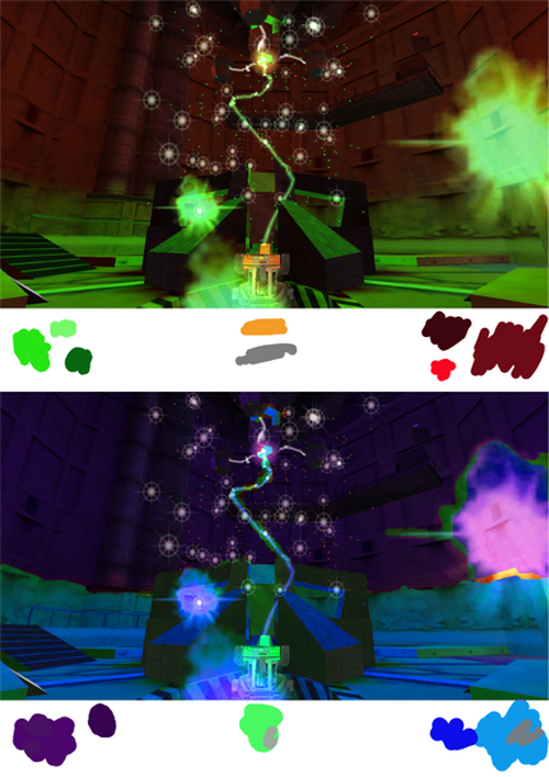
Half-Life Color Study
GD 110 Assignment (Half-Life) » Devlog

This image is important to the game. It shows the cataclysm that sets the entire game. The red areas indicate danger and make it known that there is an emergency. The green indicates a level of toxicity and raw power that serves to double up the danger. Overall, the sense from this scene is that something terrible has just happened.
I have changed the color scheme to cooler colors. Now a gentle bluish purple glow fills the room and the particles might indicate healing or relaxation. The room becomes almost friendly compared to the way it was before.
GD 110 Assignment (Half-Life)
More posts
- Headcrab ModelApr 12, 2022
- Denizen animationApr 05, 2022
- Pixel Impostor: DenizenMar 28, 2022
- Half-Life Inspired Character Design "Denizen"Mar 15, 2022
- Half-Life input media redesignMar 01, 2022
- The Retro Game of my Choice: Half-Life (1998)Feb 22, 2022
Leave a comment
Log in with itch.io to leave a comment.